Thursday, 1 April 2010

Q Contents Analysis

The layout for this music magazine is quite simple yet effective in its delivery as it serves all the purposes of a contents page by; informing the reader about which pages to refer to. It is effective in maintaining the readers attention because for instance, if they were to notice something on the front page which interested them, yet did not know which page it was on then they might not bother flicking through the magazine endlessly to find the page, which may deterr them from purchasing the magazine.

The headings/subheadings makes it clear to the reader that this is the contents page as it is a large/bold font and therefore attracts their attention towards it.

The photo of the band also catchers the readers attention and it is made clear to the reader the levels of importance within this group due to their positioning (e.g. people at the forefront of the image = more important/popular)

The colour scheme used within this contents page is quite dark and similar i.e. black/red/white. Also, the fact that the band are also wearing dark colours may suggest their music is quite heavy and that they are possibly anti authority rebels, so this may suggest that this magazine attracts this particular demographic.

The OASIS SPECIAL is again a way of attracting people to the magazine as it relates specifically to Oasis fans and would therefore appeal to them.

My Double Page Spread


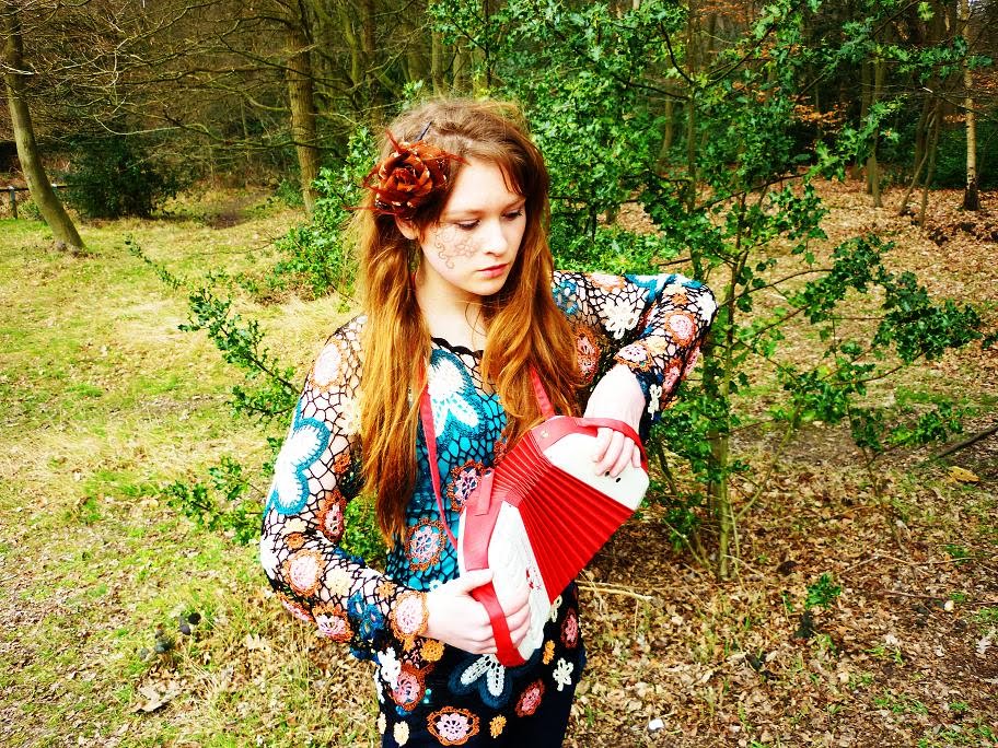
This is my double page spread. I chose to have images dominating the page as it felt this represented my key demographic (creatives/experimentalists) as it is bright and vivid and has an artistic feel to it. I believed that the pose/facial expression of the artist also depicted a somewhat serious tone to the interview as this person is not smiling. I used a high angled camera shot as I though it created more variety than just shooting from straight on. I feel that this caused the artist to seem as if they are squaring up to the camera in a way, which depicted my secondary demographic of anti authority rebels. I maintained a similar background for all of my pieces of work as i felt it flowed better that way and i used a lot of transparent backgrounds, so that the photo was still visible beneath the writing and, in this particular photo, you could still just about see the instrument. I felt it was important that an instrument was visible in all of this 'bands' photo's as it shows a dedication to music, which i wanted to portray in order to relate to my demographic who I believed would be very much into their music and not just mainly the image that may come with the music. I used a pull quote in the middle of this double page interview as i have seen this feature used effectively in other magazines, wiht the intention to grab the readers attention. As well as this I used text box's to fill up the page and ensure that the reader does not get bored or lose focus. I felt the words 'World exclusive' in large font/capital letters portrayed a sense of urgency for the interview to be read and is a persuasive technique to once again urge the target audience to read.

Wednesday, 31 March 2010

Contents Page

my contents page I created a background from the photos I took of my artists. However, I thought that the artists should not be on the contents page as the background as a normal music magazine would not centre every page around one band/artist. However, I still wanted to use the photo’s to tie in with the theme of the magazines bright colours and natural backgrounds. I decided this after I tried to create a background just using paint and not the higher quality/more professional looking background. 

I edited a photo with the male artist in it so that it was just the scenery. I done this using the programme paint. It involved selecting parts of the image and flip/rotating them to create a pattern that flowed well and didn't look bad. I then formatted it so that this image fitted to an A4 portrait size.


Tuesday, 30 March 2010

Fonts/Layout/Graphology for my front cover


After sorting out the size/shape of my magazine front cover I went on went on to include more features that are conventionally found on music magazine covers such as smaller photo's of bands/artists which portray what may be found inside the magazine. I noticed that often the title of the magazine is obscured in some way by, for example, the head of an artist. However when doing this I felt that this did not seem to look very professional and decided I wanted the title to be seen fully as it was an important feature.

                                        
I gradually built up my magazine front cover until I was happy that it looked good/effective enough. I used managed to fit my previous title 'Empirical' into the magazine by making it the name of the band fronting the magazine. I used simpler yet traditional fonts for subheadings/strap-lines as the main font (JI hidden vines) is quite decorative and could be overpowering if used too extensively. I included images as 'posters' which are featured in the magazine and carefully chose real life artists/bands that I felt fitted in with the vibe of my specific music magazine. I also purposefully included 'Glastonbury' festival on the front page as I felt this also tied in nicely with the creative atmosphere of my magazine.

Fonts/Layout/Graphology for my front cover


The first problem I faced was that the photo's I took were landscape, whereas the front cover of the magazine is meant to be portrait, to fit the criteria. I tackled this by selecting part of the background at the top of the image and copying/pasting it to create an A4 portrait like shape. I then added this to the bottom of the image but was not completely pleased with it and felt it didn't flow very well...

1.

2.


3.

I tried some fonts to see if this could make the possible front cover look any better. The font I used was called 'JI hidden Vines.' I quite liked the font and felt it reflected the creativeness that I wanted to portray in the magazine, but I felt it was quite hard to read, especially because of the colour of it and the fact that the title I originally chose was quite long winded. I liked the word 'Empirical' as it meant experimental and this was the audience I wanted to aim my music magazine at. I worked out that having the background beneath the photo did not look very professional so I decided to repeat the background even more above the 'artists/band' in the photo in order to maintain the A4 portrait shape. This did appear to be make the image seem quite fuzzy and lower quality so I decided the best thing to do was to blur the background slightly, whilst keeping the subjects in focus to show their importance and catch the readers eye. I also felt that the colour was not quite as bright as I'd have liked it to be after I blurred the background so I once again enhanced the brightness/contrast/hue/saturation. After trying many different titles I settled on 'SOLE' as it was short/snappy and also reflected the nature of the magazine I aimed to create. It also, aesthetically, looked more appealing as it was shorter and could fit on the page in capital letters, which once again draw the readers attention to the magazine. This also meant I could keep the font type that I like (JI hidden vines) and still ensure the magazine looked effective. Also, instead of using a brown font colour, I decided to use a brighter, cream/mustard yellow one which I thought worked well in contrast to the dark greens of the background. I felt that using earthy tones/colours worked well in my magazine as it once again related back to the photo's and their setting/background and made the music magazine flow well. I thought it may also create connotations of the music depicted in the magazine to be somewhat raw and natural, which I thought may have related to the creativeness of the audience.

Production of my music magazine front cover

I edited this image for my front cover. As I had decided from my questionnaire results that the demographic for my magazine was to be aimed at Creative’s/Experimentalists and also possible Anti Authority Rebels. I decided that the colours of my magazine should be bright/vivid and therefore eye catching to reflect my audience’s similar nature. To draw the reader in and relate to them i named the magazine 'SOLE' as it means 'one', suggesting the magazine and also readers are one of a kind. I considered at length the type of music styles/bands/artists to feature in my music magazine and came to the conclusion (with relation to my survey and also my own personal idea's) that this should involve unique artists as the creative audience are likely to be highly individual too, so this would suit their personalities. I made sure my artists were somewhat kooky through the use of the props/ clothes/setting. I used instruments in my shots as I wanted to portray the importance of the music, and not just the image alone. As well as this, I chose a natural backdrop for my entire photo's in the photoshoot. I felt that the colours of these could be made particularly vivid and eye catching and also felt that it depicted the artist’s individual natures. To achieve this I altered the photo's hue/saturation which can increase/reduce the amount of a certain colour in the photo. I enhanced the green and the red within this photo. As well as this, I increased the photo's brightness/contrast to create a dramatic, colourful effect. However after altering this image I still felt that it wasn't quite right for the front cover as it seemed a bit bare.

↓

↓


I decided to use this photo, as well, for the front cover. I applied the same techniques to it by using photoshop/photoimpression5. I then went on to merge both photo's together...

↓

I done this by copying the layer image of myself onto the original photo of the male artist (chris) I didn't feel the image worked as well with Chris on the right hand side, so i flip/rotated the image and proceeded to merge myself into the image using the rubber tool to rub out the background of the original photo of me. I decided to include both male and female artists to attract the widest audience possible and as my research stated, people prefer to see both genders on the front of the magazine.

Wednesday, 3 March 2010

The survey I created included 11 relative questions about music magazines. I conducted this survey in school and asked 13 random people. Most happened to be students and in the age range of 16-20, but one was aged from 35-40 which gave me a slight variation. The results i got are as follows:

Males: 6
Females: 7
People that read music magazines: 7
People that don't read music magazines: 6

Ages:
5-10: 0
11-15: 0
16-20 yr olds: 12
21-25: 0
26 - 30: 0
31-35: 0
35-40 yr olds: 1
41+: 0

Genre of music preference:
Pop: 2
R'n'B: 0
Rock: 2
Indie: 5
Soul: 1
Metal: 2
Rap: 0
Other: 1

Music magazine preferences:
Kerrang: 3
Rolling Stone: 2
NME: 6
MOJO: 1
TOTP: 1

Reading Preferences:
Gossip: 1
Articles: 4
Interviews: 7
News Stories: 1

Front cover preferences:
Females fronting: 0
Males fronting: 2
Either: 11

Other reading preferences:
Female: 1
Male: 2
Either: 10
How much aesthetic features of a magazine affect them buying it:
Not at all: 0
Sometimes: 3
A fair amount: 6
A lot: 4
Demographics: what would you class yourself as?
Anti authoritarian: 2
Joiners: 0
Admiration Seekers: 1
Pleasure seekers: 4
Security and stability seekers: 0
Generation x: 0
Materialists: 1
Achievers: 0
Experimentalists/creatives: 5