
I edited this image for my front cover. As I had decided from my questionnaire results that the demographic for my magazine was to be aimed at Creative’s/Experimentalists and also possible Anti Authority Rebels. I decided that the colours of my magazine should be bright/vivid and therefore eye catching to reflect my audience’s similar nature. To draw the reader in and relate to them i named the magazine 'SOLE' as it means 'one', suggesting the magazine and also readers are one of a kind. I considered at length the type of music styles/bands/artists to feature in my music magazine and came to the conclusion (with relation to my survey and also my own personal idea's) that this should involve unique artists as the creative audience are likely to be highly individual too, so this would suit their personalities. I made sure my artists were somewhat kooky through the use of the props/ clothes/setting. I used instruments in my shots as I wanted to portray the importance of the music, and not just the image alone. As well as this, I chose a natural backdrop for my entire photo's in the photoshoot. I felt that the colours of these could be made particularly vivid and eye catching and also felt that it depicted the artist’s individual natures. To achieve this I altered the photo's hue/saturation which can increase/reduce the amount of a certain colour in the photo. I enhanced the green and the red within this photo. As well as this, I increased the photo's brightness/contrast to create a dramatic, colourful effect. However after altering this image I still felt that it wasn't quite right for the front cover as it seemed a bit bare.
↓

↓
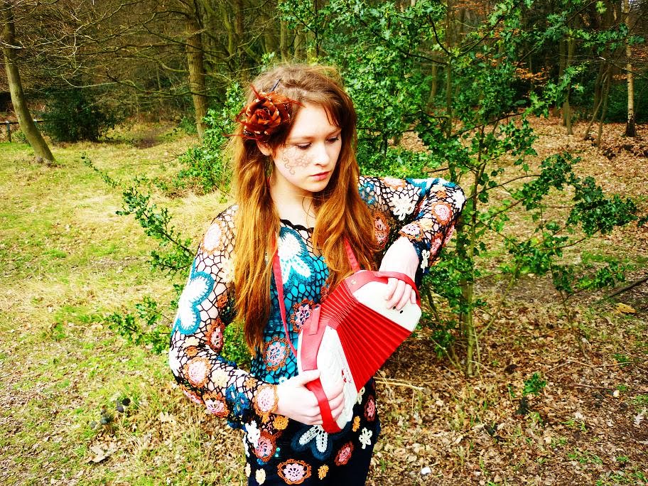
I decided to use this photo, as well, for the front cover. I applied the same techniques to it by using photoshop/photoimpression5. I then went on to merge both photo's together...
↓

I done this by copying the layer image of myself onto the original photo of the male artist (chris) I didn't feel the image worked as well with Chris on the right hand side, so i flip/rotated the image and proceeded to merge myself into the image using the rubber tool to rub out the background of the original photo of me. I decided to include both male and female artists to attract the widest audience possible and as my research stated, people prefer to see both genders on the front of the magazine.
No comments:
Post a Comment